OVERVIEW
Finding time to ride is hard—planning the ride shouldn’t be. This Garmin Connect redesign introduces a more cohesive visual system while consolidating tools and using FTP data to better estimate ride duration based on a rider’s personal metrics.
Instructor
Bill Flores
Time Frame
4 Weeks

BEGINNINGS
Approach + Framing
During a teardown of the current app, I identified several issues with the existing Garmin experience. Small type, visual clutter, and dated UI design were all holding the app back from functioning effectively and presenting a compelling visual experience.
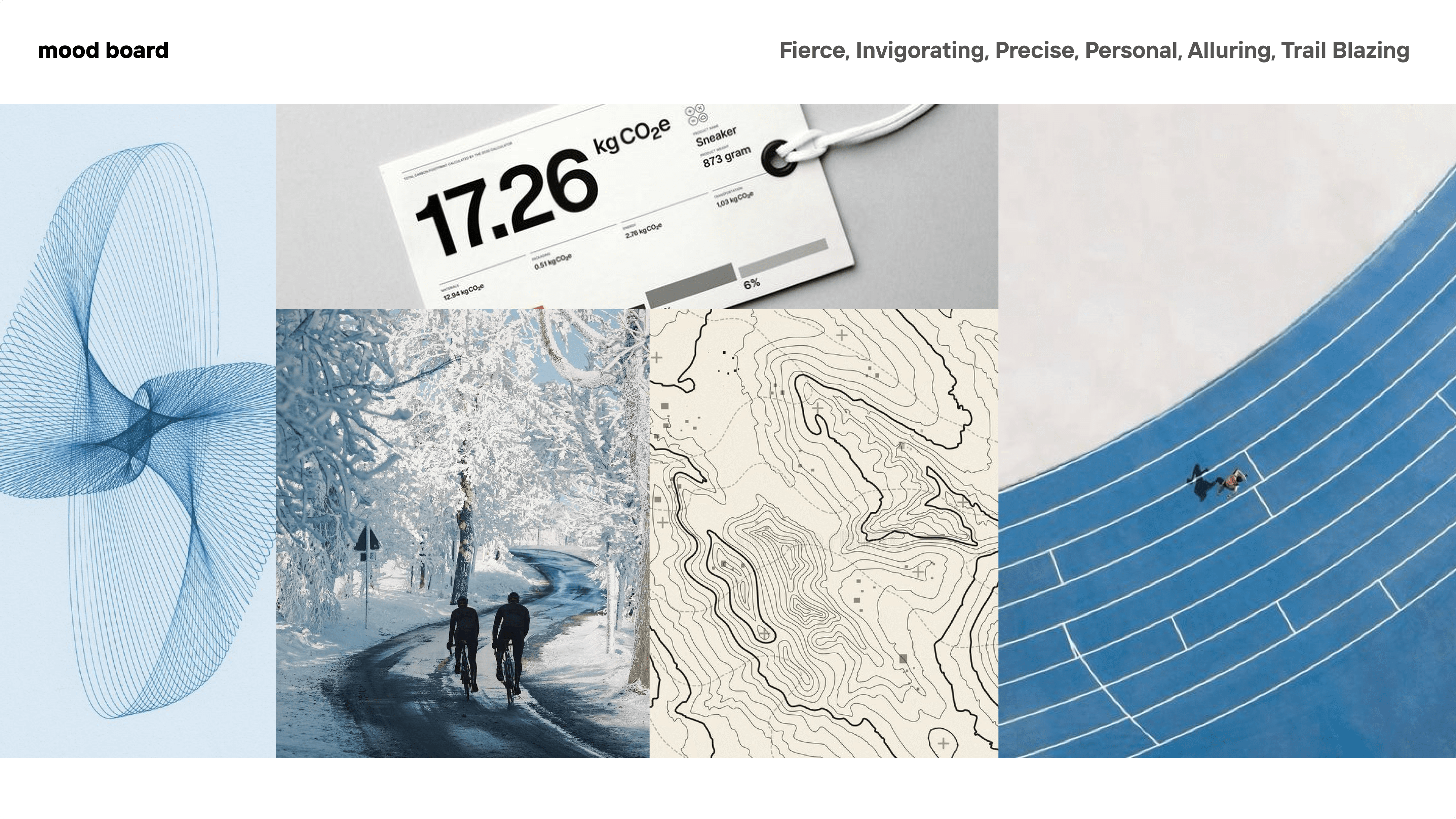
I wanted the app to reflect the feeling of tracking metrics: precise and focused, while aligning with contemporary visual styles to create a more cutting-edge experience.
APP DESIGN
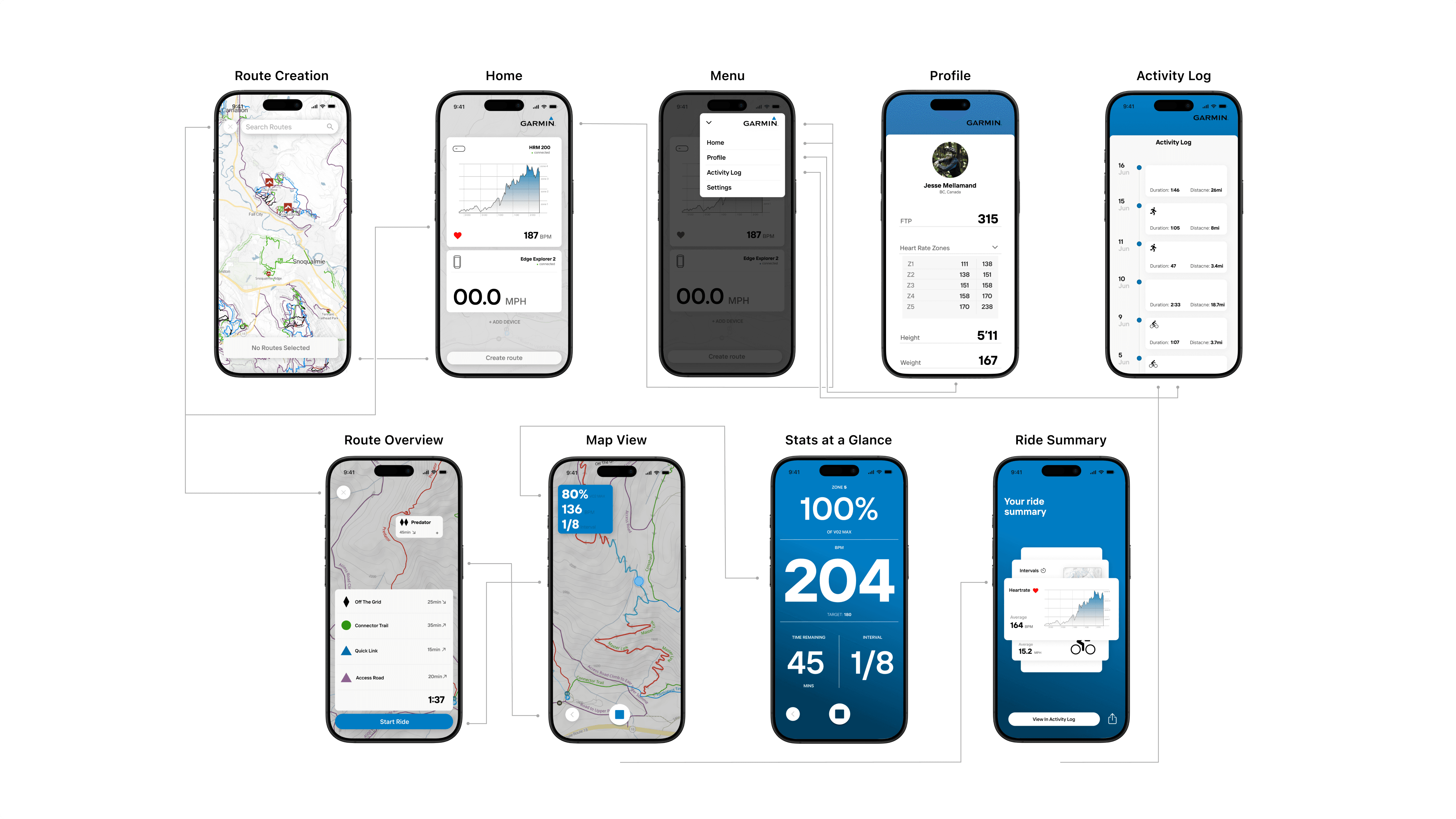
Information Architecture
When designing the app’s features, the primary goal was to give cyclists a better sense of how long a route will actually take. Mileage and elevation alone are poor indicators of duration.
By incorporating FTP (Functional Threshold Power), a metric widely used by cyclists to measure effort and performance, the app can estimate ride duration much more accurately. Combined with a simplified interface that is easier to check during workouts, the result is a tool that streamlines planning and gives cyclists more time to do what they love most: ride.
BEGINNINGS
Final Thoughts
During this project I learned a great deal from instructor Bill Flores about designing interfaces that are both visually compelling and intuitive to use. I can also see how a tool like this could extend to neighboring disciplines such as rowing, running, and other cardiovascular activities.
The next step is to start vibe coding the app. I’m excited to bring the design to life and better explore the problems and improvements that emerge through building and testing it.
